


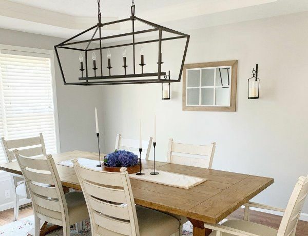
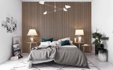
Cream colors are an ever-present part of most households. There is a good reason for their popularity. They provide a sense of warmth and make the room feel bright and airy. Their muted tones make other elements like painting and furniture stand out.
Choosing the perfect creamy color can significantly impact the overall look and feel of your house. Cream tones provide a versatile and timeless aesthetic that complements various interior styles, from traditional to modern.
These cream colors offer a range of hues, allowing you to find the perfect shade that suits your personal preferences and desired ambiance. These colors can enhance natural light, create a sense of calm and peace, and serve as a great background for displaying artwork and furniture.
Whether you’re looking to renovate your living room, bedroom, or kitchen, understanding the most popular creamy colors will help you come to an informed opinion of what’s best for you.
With us, explore the 15 most popular creamy paint colors that can transform your house into a warm and cozy space to be proud of.
What is Light Reflectance Value (LRV)?
You might hear this term often while researching colors. LRV, in simple terms, is the measure of the amount of light that is reflected off a particular surface. Different colors reflect light in different ways. LRV is measured on a scale of 0 to 100, with 0 being perfect black and 100 being pure white. A higher value means that the paint reflects more color, appearing lighter. LRV comes in handy when choosing colors that need to be contrasting and give different moods.
Popular Creamy Paint Colors for Your House
1. Maritime White

Maritime White by Benjamin Moore is an inspiring creamy color known for its off-white, beige tones. This versatile shade brings a sense of warmth and sophistication to any interior space. With its subtle undertones and neutral characteristics, Maritime White provides a serene and inviting ambiance that complements a wide range of design styles. Its lean undertones have shades of orange and even look pinkish in a certain light.
Its LRV of 73 allows it to harmonize with various color palettes and furniture choices, making it a popular choice for both modern and traditional interiors. Whether you’re looking to create a cozy living room or a serene bedroom retreat, Maritime White offers a classic and soothing option for your home.
2. Sand

Sand by Farrow & Ball is a color that embodies the charm of the soft sandy beaches of Malibu. This warm and versatile shade reflects the soft and earthy tones found in sandy spaces. With its dark beige undertones, Sand offers a calming backdrop for any interior space. It pairs beautifully with both traditional and contemporary design styles, blending especially well with black, navy, or even marble.
With an LRV of 33, this is the darkest color on this list. Yet, it is a popular choice among homeowners and interior designers alike. Its versatility allows it to complement a wide range of furnishings, and natural materials, making it an excellent choice for creating a harmonious and inviting presence.
3. Timid White

Another classic by Benjamin Moore, Timid White, is a charming creamy color that oozes panache and gives off an inviting aura. This rather understated hue offers warmth and can effortlessly enhance any space. With its soft off-white undertones, Timid White creates a serene and peaceful ambiance, making it an ideal choice for creating a calming atmosphere in your home.
A peculiar thing about this creamy color is that it also works as a timid yellow! This touch of yellow hidden deep exudes warmth and makes your room bright. With an LRV of 82, it blends with a variety of design styles, offering endless possibilities for creating a unique and harmonious interior.
4. Schoolhouse White

This Farrow & Ball concoction is a beautiful creamy white color that exudes luxury and status and the same time. This versatile shade, often associated with classic design aesthetics, provides a refined and subtle elegance to any interior space. With its moody undertones and creamy off-white hues, Schoolhouse White creates a clean and crisp background that provides a soft glow to your room.
Whether used on walls, trim, or furniture, this unique color adds a touch of traditional charm and versatility. It pairs beautifully with industrial colors and concrete floors. Schoolhouse White has an LRV of 74, which effortlessly complements a variety of color schemes and decor styles.
5. Linen White

As you might have guessed, Benjamin Moore shades are quite popular among homeowners. You can never go wrong with Linen White. It is a serene creamy off-white color with yellow undertones similar to Timid White. This delicate and airy hue brings a sense of calmness, making any space cozy and comfortable. With its subtle shades, Linen White feels like a fresh piece of linen on your walls.
With an LRV of 83, it is one of the lightest colors still in the off-white range. If you have wooden flooring or staircases, this is the color for you. Whether used as the main color or as a trim, Linen White adds a touch of coziness and warmth to your interior, making it a popular choice among homeowners.
6. Pale Oak

Pale Oak by Benjamin Moore is a great choice when paired with warm wood furniture and floors, as it creates a harmonious and inviting atmosphere. This creamy color is particularly effective in brightening up spaces that were previously painted with dark colors, offering a refreshing transformation. The versatile nature of Pale Oak is evident with its 69 LRV. The taupe undertones result in a seamless and complementary color scheme.
Moreover, for rooms with abundant greenery outside, Pale Oak’s warm taupe tones blend splendidly to neutralize any green hues that may reflect through the windows. This creates a balanced and soothing environment that seamlessly connects the indoor and outdoor elements.
7. Cloud White

This beautiful creamy color makes you feel like you’re on cloud nine. Cloud White (You guessed it, Benjamin Moore) is a stunning off-white paint color with a soft allure that looks great irrespective of lighting. Due to its warm and subtle taupe undertones, Cloud White effortlessly enhances the beauty of any space. It serves as an excellent choice for your walls while also making a delightful option for trim, cabinets, or ceilings.
With an LRV of 87, this creamy color thrives in well-lit rooms. It can also adapt gracefully to spaces with some shadows. It is commonly used in modern kitchens as a monochromatic scheme.
8. Alabaster

Alabaster is an extremely popular creamy color for modern homes. With its Taupe undertones and creamy hues, Alabaster creates a soft and inviting atmosphere in any room. This highly adaptable shade harmonizes beautifully with a variety of design styles, making it a popular choice for modern spaces.
Its neutral nature allows it to fuse effortlessly with traditional themes as well, making it an excellent choice for creating a cohesive and timeless interior design. With an LRV of 82, Alabaster by Sherwin Williams is a fresh yet enduring choice for those seeking a sophisticated and welcoming ambiance in their home.
9. Sherwin Williams Creamy

Creamy by Sherwin Williams is a rich, sophisticated color that is equal parts elegant and bold. It has a smooth coffee undertone that gives the shade its beauty. This creamy color is a versatile off-white paint color that exudes a smooth and inviting ambiance. With its adaptable nature, Creamy seamlessly blends with various design styles and color schemes. This versatile shade adds a touch of yellow and brown to the white while never making it overpower the base color.
This makes it a popular choice for walls, trim, and accents. With an LRV of 81, it brings a sense of comfort and serenity, allowing for endless possibilities when it comes to creating a harmonious and inviting interior design.
10. Casa Blanca

Its captivating tones and moody neutrals have led to many people calling this color the “Goldilocks of creamy colors.” With its creamy vibes and subtle hints of beige, Casa Blanca creates a tranquil and lazy aura in your home. Like most cream colors, it dabbles in a bit of yellow that gives it that distinct hue. In this case, the soft neutral balances off against the yellow, giving it a more natural look.
These neutral and soothing qualities make it an excellent choice for creating a calm and inviting ambiance in your home or office. If you’re painting your walls with Casa Blanca, try using Alabaster or Cloudy White as your trim. Casa Blanca has an LRV of 76.
11. Winter Wheat

The name might be a bit of a misnomer, as it often evokes the feeling of a brownish autumn forest. Winter White by Benjamin Moore contains some delicious earthy textures that make it darker than other creamy colors. Very similar to Casa Blanca, Winter Wheat offers a more neutral texture that makes it softer. It has a smooth cream base that brings the beige down and gives it a light shade.
This shade has an LRV of 76, making it sit comfortably in the off-white range. Winter Wheat by Benjamin Moore is sure to create a soothing and welcoming atmosphere that you’ll love coming home to.
12. Gentle Cream

Gentle Cream by Benjamin Moore is a luscious creamy color that shares similar undertones with Winter Wheat, resulting in a warm and welcoming ambiance with a subtle, neutral texture. This shade blends exceptionally well with earth tones and neutrals such as chocolate brown and charcoal, making it a versatile choice for creating a cozy and inviting atmosphere. It also works wonders in dark hallways, providing a warm and soothing look without appearing too stark or white.
With an LRV of 72, this creamy color is slightly less light compared to Winter Wheat, but it still infuses your room with delightful energy. Embrace the enchanting charm of Gentle Cream and elevate your space with its inviting and radiant qualities.
13. Indian White

Indian White by Benjamin Moore is similar to Gentle Cream but feels lighter and has lesser weight about it. It leans slightly more towards an orange-beige tone, giving it a distinct character. It serves as an excellent choice for a home paint color, providing a warm and inviting ambiance throughout.
When used together with features or trim, Indian White acts as a complementary partner, allowing the focal points to stand out while maintaining a harmonious balance. With an LRV of 75, Indian White adds a touch of warmth without overwhelming the space with excessive color.
14. Swiss Coffee

Unlike most other creamy colors, Swiss Coffee by Benjamin Moore offers a hint of gray along with all the white and beige. It is a warm color that provides a light and clean feel to your home. This modern color gives off an incredibly inviting aura due to the yellow, while the grays offer a touch of coolness and distance.
Whether used to paint walls or just as trim, Swiss Coffee provides a clean and fresh aesthetic that brightens up the room. Due to an LRV of 84, this creamy color is on the lighter end, serving as a lovely backdrop for various artwork and furniture.
15. Ballet White

Ballet White by Benjamin Moore is a remarkable neutral shade that brings a touch of sophistication to any space. Unlike the creamier tones in the lineup, Ballet White features a beautiful blend of beige and gray, which greatly grounds its yellow-cream base. If you prefer a slightly cooler and less warm-toned option, this creamy color might be the perfect choice for you.
With an LRV of 72, it is almost reminiscent of a greige hue when compared to the other colors mentioned. This unique combination gives Ballet White a warm yet distinctly neutral appearance.
Conclusion
The popularity of creamy colors continues to rise due to their timeless appeal and versatility in interior design. These shades offer a range of options to suit various preferences and design aesthetics. From soft and subtle tones to warm and inviting hues, these colors have the power to transform your house into a warm and inviting space.
Cream paint colors provide a neutral backdrop that allows for effortless coordination with other elements of your interior decor. Whether you prefer a more traditional look or a contemporary style, these cream shades can harmonize with different furniture styles and accent colors, giving you the flexibility to personalize your living spaces.
When selecting a cream paint color, it’s important to consider the natural lighting in your space, as well as the undertones that complement your existing furniture and decor.
Tags:Farrow & Ball