


Your home is one of the only places where you can be completely yourself; your real personality comes out in a place decorated according to your tastes. You can relax, cook, sleep, watch TV, read, spend time with family, hang out with friends, and much more in your home. That’s why keeping your house updated is an important step in making sure your house is safe and clean.
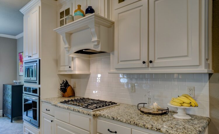
Your cabinets are the first anybody sees when they enter a room since they are at eye level, so do consider the color when picking out the cabinets. If your cabinets need a fresh coat of paint or you are tired of the color, then this article will help you.
This article has a Sherwin-Williams cabinet paint color list for you to pick from. This way, your house will look brand new, like a remodel, with just a fresh coat of paint.
Sherwin Williams: A Brief
Sherwin Williams is a company that manufactures, distributes, and sells products like paints, floor coverings, coatings, and other related products; it is based in Cleveland, Ohio, in the United States.
They make products for professional, retail, industrial, and commercial customers in North America, South America, and Europe. Their most popular paint colors for cabinets are listed below. But remember, these colors will look slightly different under different lights.
1. SW 7008 Alabaster

This shade of Alabaster was the Sherwin Williams Color of the Year for 2016; this neutral paint color will be the perfect backdrop to showcase any decor. It has a Light Reflectance Value (LRV) of 82; the LRV refers to how much light the paint color will either absorb or reflect. True black has an LRV of 0, and an LRV of 1 is for pure white. The decor will be the main star of the room, and you can easily change the decor when you want to.
This color is a soft, creamy off-white shade so that your room will be warm and cozy. In regard to undertones, Alabaster has subtle beige ones. Alabaster is a straightforward color in a world of overstimulation, so you can focus on your cooking instead of being distracted by the decor.
2. SW 6244 Naval

The shade of Naval is a very favored color in interior design, which is why it is not surprising that it is on the list of popular cabinet paint colors. There are gray-green undertones to this shade, and the LRV of Naval is 4, meaning it absorbs most of the light.
Naval will not overwhelm your room when you pair it with neutral colors like Extra White, Sea Salt, Agreeable Gray, Crushed Ice, etc. Besides your kitchen, this deep navy blue color will look amazing anywhere in your house. In 2020, Naval was the Color of the Year for Sherwin Williams.
3. SW 7015 Repose Gray

Repose Gray is a neutral gray color that can be used in any room of your house. This shade’s LRV is 58; a higher LRV means the paint color will reflect more light. You can find this shade in Sherwin Williams’ collections of Senior Living Cool Foundations, Dreamer, and Pottery Barn – Spring/Summer 2019.
This Sherwin Williams cabinet paint color may have gray in its name, but the undertones are a mixture of gray, greige, brown, and purple. Since this color is so versatile, it can be a wonderful backdrop for other decor styles.
4. SW 6204 Sea Salt

The Sea Salt shade is a muted green color with blue undertones; you will feel like you are in a spa or having a relaxing beach day, so that’s why it is a popular choice for bathrooms. The LRV of Sea Salt is 63, so that means it reflects more light than it will absorb.
This green color is in between Aloof Gray and Rainwashed since it is part of the green hue family. Depending on the lighting, this shade will be green-blue and green-gray. Along with Sea Salt, you can add colors like Pure White, Tempe Star, Greek Villa, and Gale Force to your home.
5. SW 0068 Copen Blue

Copen Blue is in the Blue color family, as it says in the name. Blue is a calming color which is what you want, especially in a kitchen due to the various hot and sharp things. Copen Blue’s LRV is 59, meaning it reflects more light than it absorbs.
Copen Blue was Sherwin Williams’ Color of the Month in 2021; the color collections that include this shade are Creative, Historic Interior Color Wall, Teen Space, The Streamlined Years (the 1930s-1950s), and Living Well–Focus. It has a green undertone, but you might see a blue undertone in natural light. You can pair Copen Blue with light colors in your house.
6. SW 9589 Limewash

Limewash is from the neutral color family. The LRV is 67, so Limewash reflects light more than it absorbs it. Limewash is lighter than the shade of Taupe of the Morning, and you can create texture and add more depth to your house.
You can transform your house with this old-world style from the Limewash shade. You can even use it in all areas of your home, and you will have a gentle background for plenty of conversations and quality time with your friends and family.
7. SW 9587 Mushroom
Mushroom might be a weird name for a shade, but it is part of the neutral color family. It is a soothing color, and its subtle tones will make your house more sophisticated. The LRV is 57, which means that the Mushroom shade reflects just a little more light than it absorbs it.
This shade can work with various design styles, like minimalist, farmhouse, or modern, so you do not have to worry about it clashing with your room. It can also be used anywhere else in your home due to its versatility. This is the reason why this color is slowly becoming extremely popular in interior design for your house.
8. SW 7666 Fleur de Sel

Fleur de Sel is part of the white color family, and its LRV is 72, meaning that light is reflected more than absorbed. This Sherwin Williams cabinet paint color has a green undertone, that’s why it looks bright and dreamy.
For a monochromatic pairing, try out colors like Tinsmith, Ellie Gray, or Lattice, while for contrast, there are Caviar, Wall Street, or Malted Milk shades, all from Sherwin Williams. You can use Fleur de Sel with design styles like Modern, Scandinavian, Contemporary, etc. Likewise, you can use this color in any room in your house, along with your kitchen.
9. SW 7029 Agreeable Gray

The Agreeable Gray color is in the neutral color family; this gray color is soft and warm, which is why it will look wonderful on your cabinets. The color will provide a neutral backdrop in your home so that the rest of the colors will shine. It is a good mixture of warm and cool tones.
The LRV is 60, so more light is reflected than absorbed, which is perfect since this shade will work in well-lit rooms as well as dimly-lit rooms. Sherwin Williams’ Dovetail, Snowbound, Sea Salt, Brainstorm Bronze, Basil, Pure White, and Alabaster, Riverway are excellent coordinating colors for Agreeable Gray.
10. SW 7643 Pussywillow

Pussywillow is part of the neutral color family. This gray shade is dark with deep gray and brown undertones. The LRV is 42, meaning that light is absorbed more than reflected. This shade makes you feel relaxed in your house. Shades like Dorian Gray, Black Fox, and Dovetail are perfect coordinating colors for a monochromatic setting. For contrast colors, check out Gris Morado, Rainwashed, and Black of Night.
If your house has a Modern, Farmhouse, or Minimalist design, this color will go perfectly well; you have brass handles for a nice contrast and white backsplash tiles to add more depth to your house.
11. SW 7005 Pure White

Pure White is a gorgeous and beautiful color, and it is the perfect shade of white to use anywhere in the house. The color’s LRV is 84, which means this color reflects a lot of the light coming into your room. It is a wonderful mixture of warm and cool tones.
This shade of white is soft and clean; it has a neutral base. The white color complements all other colors so that you can use any other shade in your house, colors like Revere Pewter, Repose Gray, City Loft, Sea Salt, and more. Pure White is one of the best-selling paint colors of Sherwin Williams.
12. SW 7022 Alpaca

Alpaca is more than the average warm gray or taupe color; it is a warm and neutral color. Alpaca’s LRV is 57, which makes it a lighter-toned color; it has strong, slightly purple and red undertones. This warm gray will look like beige and gray, but it does have a greige appearance. If you paint your cabinets the Alpaca shade, then your house’s look will be sophisticated and subtle. You can easily run your fingers over your cabinets since Alpaca has a smooth texture. Your house will look brighter and more spacious with the shade on your cabinets.
13. SW 7017 Dorian Gray

Dorian Gray is one of the top 50 best-selling paint shades of Sherwin Williams. The LRV of this shade is 39, meaning that it does not reflect much light, and it comes from the yellow hue family, which is why there is a bit of warmth to the color. Sherwin Williams has included Dorian Gray in the Acute Care Cool Foundations, Senior Living Cool Foundations, Living Well–Renew, and Top 50 Colors collections. This mid-tone gray color is elegant, sophisticated, and soft, along with depth. Extra White, Pure White, and Alabaster are great complementary colors for Dorian Gray, especially for trim colors.
14. SW 7069 Iron Ore

Next on the Sherwin Williams cabinet paint list is Iron Ore. This shade is part of the neutral, gray family, and it has an LRV of 6, which means it absorbs most of the light. This shade is not completely black, but it is soft black. For anybody who wants black cabinets, not pure black, then Iron Ore is the perfect substitute. On your cabinets, you will see slightly green undertones; just be aware of that when picking this color. Warm whites, greens, and other earthy color tones go really well with Iron Ore; for example, Extra White and Nebulous White. Iron Ore is lighter than Tricorn Black, Black Magic, Inkwell, and Caviar.
15. SW 7674 Peppercorn

Peppercorn is a versatile dark gray color as it has an LRV of 10; it is an even balance of warm and cool. It is a few steps above the pure dark shade. With Peppercorn, your cabinets will be a bold focal point in the room; you can even have a rich exterior since the Peppercorn shade is full of depth. It comes from the purple hue family, but it will not look like you have purple cabinets. You might see a flash of purple in unbalanced lights, that’s all. Colors that are complementary to Peppercorn include Chantilly Lace, Pure White, and SW Extra White.
How to Choose a Color for Your Cabinets?
When you start browsing for paint colors for cabinets, you need to take into account things like your counters, walls, floor, backsplash, and appliances. You want your decor to look balanced and complementary. The things to consider are cabinet style, decor style, room size, countertop color, lighting – natural and artificial, floor color, backsplash, and appliances.
Do research into the various colors available at Sherwin Williams for your cabinets so that you will love your cabinets for years to come. Go to Pinterest and Google to see how the cabinets look with the colors you like.
Final Thoughts
Your house is a reflection of your creativity since this is where you live your life, and your decor skills are on display. Painting your cabinet is a budget-friendly way of renovating your house; this can also be a do-it-yourself project in which you can involve the whole family. You have to remember important things like cabinet style, lighting, room size, decor style, etc., when considering which color to paint your cabinets.
Luckily for you, this article has laid out a list of Sherwin-Williams cabinet paint colors. With this article’s help, you can easily pick the paint color you want for your cabinets. After all, you want your house to look beautiful, and the decor should be well-balanced.
Write down in the comments below which Sherwin-Williams color you picked for your cabinets, what other color choices you were considering, how many times you have painted your cabinets, and other important details you think everybody should know.