A month or so before Christmas I finally took the plunge and repainted all of the slightly-too-bright-always-bothered-me-yellow that was all over our main floor. I know I gave you a little snapshot of the new colour but I never took the time to take some nice, daylight photos of each of the rooms in their lovely new gray.
So here's a little tour. Please keep in mind that the too-bright-yellow stifled my decorating and all of these rooms need some finishing up - whether it be with curtains or cushions or wall art or rugs. We've got most of the basics... now we just need the extra little details.
 |
| Living Room |
 |
| Living Room |
 |
| Living Room |
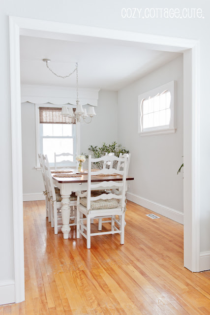 |
| Dining Room |
 |
| Dining Room |
 |
| Dining Room |
 |
| Dining Room |
 |
| Dining Room / Living Room |
 |
| Sunroom |
 |
| Front Entry |
 |
| Front Entry |
The yellow colour that we used to have in all of these rooms was called Sweet Buttercup and it was a CIL Smart colour from Home Depot. It was always on the too-bright side for my liking but it was the third yellow we had tried and at that point I had just said "good enough" (big mistake).
So here's a side-by-side photo of the old colour vs. the new colour.
The new colour is called Gray Owl by Benjamin Moore. Except I used the colour at a half-tint or half-strength so that it would be slightly lighter. I used a flat finish since we have textured plaster walls with lots of cracks and imperfections. It's definitely a calming colour that's for sure.
Well, do you like it, do you like it, do you like it!?!?!?!
Sharing here:
Saturday Nite Special @ Funky Junk Interiors,
Frugal Friday @ The Shabby Nest,
Show and Tell Friday @ My Romantic Home,
Lovely Crafty Weekend @ Lovely Crafty Home,
Weekend Wrap-Up Party @ Tatertots and Jello,
Sundae Scoop Link Party @ I Heart Naptime,
Strut Your Stuff Saturday @ Six Sisters' Stuff,
Nifty Thrifty Sunday @ Nifty Thrifty Things,
DIY Project Parade @ The DIY Show-Off,
Metamorphosis Monday @ Between Naps on the Porch,
Making the World Cuter Monday @ Making the World Cuter,
February Before and After Party @ Thrifty Decor Chick,
Frugal Friday @ The Shabby Nest


I love love love it! What a beautiful home. So cozy and so cutie patootie! And that side board table/cupboard in the dining room is to die for!! Did you paint that too?
ReplyDeleteThanks so, so much!! :) :) :)
ReplyDeleteThe cupboard in the dining room was from a store in Toronto called Flik and Company. We bought it just like it is now... no painting needed. And still looooove it.
Your painted room looks gorgeous! Love the look and the crispness of the room! Where did u purchase the lampshade, I love it. I will be painting in a couple of weeks, too!
ReplyDeleteYoutr main floor is GORGEOUS, Sarah! Everything looks so fresh and pulled together. I am curious about the surround on the Dining Room window - is that part of the frame or something you added? I can relate to being "over" having yellow walls - our place had 5 different variations of yellow when we moved in 3 years ago. We have eliminated all of the main floor yellow, but it still haunts us in the basement! I love your decorating style and was actually searching for your kitchen photos yesterday for some layout ideas since our house is a similar age. Thanks!
ReplyDeleteThank you ladies!!!
ReplyDeleteCoastal Cottage Dreams:
The lampshades in the living room were all Homesense finds at different times. I go in at least once a week. It's an illness. ;)
Claire:
A few of the windows in the house have wooden valences and surrounds. They are made of various pieces of trim but we didn't install them. They were there when we bought the house - part of the reason we fell in love with it's charm. :)
What a HUGE and wonderful change!! I LOVE the colour and am so happy you did it!
ReplyDeleteI love the new color, it does look so calming. I just love Benjamin Moore paint; that's all I ever use. Your home is beautiful; thanks for the tour! :)
ReplyDeleteJodi
Hi Sarah,
ReplyDeleteI love it, love it, love it. What a difference your new paint makes. Everything looks so fresh and pulled together. What a lovely house you have. You should be very proud.
Kim
Letters from the Shore
I love it! It is so beautiful and calming. Does it have a slight blue color to it? I've been searching for a color like this for our Living Room but not sure if a gray would work because the couches are a light beige.
ReplyDeleteAll the rooms look so very lovely!! I do like the gray better than the yellow. Thank you so much for the beautiful tour! Just one question...when is your hubby going to give in and let you paint that trunk? ;)
ReplyDeleteYes I do like it! Very calming...Beautiful home! Sharon
ReplyDeleteThe new colour looks beautiful and fresh, Sarah. I like how it flows from room to room. The cabinet from Flik and Co is really wonderful. The store is on my list of places to visit this summer.
ReplyDeleteWell you know I am going to love, love, love it! I also am in total like with that side cupboard in your dining room! I am ready to get rid of the rest of our yellow walls too. Now just to convince Darrell we need to get the rest of the walls the same as the kitchen where we did introduce more grey in the reno in last year. I may be using your pictures to plead my case :). Looks great!
ReplyDeleteYou definitely have my approval, Sarah! It is very calming. You have so many pretty pieces - it looks wonderful just as it is!!
ReplyDeletewow! What a transformation! I Love the new color. It seems to make your furniture pop! You have a Beautiful home!
ReplyDeleteVery pretty Color. I love your home :)
ReplyDeleteOh, goodness gracious! Yes, yes, yes! It is absolutely beautiful. I love the new color and all your decorating touches...and your pictures are beautiful, too. Thanks for sharing
ReplyDeleteThe color is beautiful and the furnishings look lovely with it. I do also love that large painting of the cabin in the wooden frame over one of your couches. Where did you get that?
ReplyDeleteI think it's perfect . You have such a great eye . You don't need an online design school just offer your services of decorating and you will surely get clients .
ReplyDeleteLove it! I really like how one commenter exclaimed how put together it looks. That is what I am trying to do in my own home. Thanks for your inspiration!!
ReplyDeleteI love the gray-it is really clean and crisp looking. You do great work with your house!
ReplyDeleteIt is adorable fresh beautiful. I too love it. Thanks for sharing. Cheers SpecialK XoXo
ReplyDeleteThese pictures look like they were pulled straight out of a magazine! Wonderful job decorating! I love the new wall paint!!
ReplyDelete-Kendall
{songbirdsandbuttons.blogpspot.com}
I am hopelessly in love with your new color! Wonderful pick and all the rooms do look calm. It changes the feel of your whole downstairs. I am really looking forward to seeing what you do next!!
ReplyDeleteBecca
OMGoodness I just LOVE it!!
ReplyDeleteI just got rid of the yellow in my downstairs bath and am so happy I did!
Can I ask what you mean by half tint half strength?
I love the new color.
ReplyDeleteIt looks so pretty!
Kathy
How is your house so PERFECT??!!! Love it. Oh maybe it's because you're perfect :P
ReplyDeleteHhahaha. So lovely.
I love the new color. The old color was nice too, but if I were to choose one over the other it would definitely be the gray. Just lovely. I have become a follower and look forward to reading your future posts.
ReplyDeleteLisa,
ReplyDeleteI STILL want to paint that darn trunk but just know that Alex will kill me. Maybe if he keeps shrinking my clothes in the dryer I'll have some leverage to work with, haha.
Sandi,
What I mean by half-tint is that the paint store peoples halved the paint formula and mixed that amount of colour with the full gallon of base colour. Does that make sense? I think it's pretty common so you could always ask at your local paint store. Hope that helps! :)
Marty,
ReplyDeleteThe large picture of the barn in the wooden frame was purchased from a local home decor store. I know they ordered it from somewhere in the states. I was able to find the print online for you though. Here it is:
http://www.art.com/products/p12792536-sa-i1924512/dysart-barn-and-field-i.htm?sorig=cat&sorigid=0&dimvals=5024620&ui=99f5129c143849b2bcc4fa8d342e070f
:)
I like the paint color. Did you purchase the slipcovers on your furniture or made them. Love them
ReplyDeleteLinda
Linda,
ReplyDeleteThe slipcovers are from Ikea and made to fit on the Extorp sofa series.
:)
I LOVE the new soft color palette, Sarah - beautiful paired with all of the natural/distressed wood tones. Dreamy! ::sigh::
ReplyDeleteRoeshel
Such a calming home. I really love those window cornices too!
ReplyDeleteOh how I love it all! And I love the new paint color. What a difference it made! Even though it's lighter, it actually made all of your furniture piece pop! Love what you've done.
ReplyDeleteI just want to know where your dining room table came from? I love the table!!
Thanks for sharing your lovely home with us. You're amazing!
Beautiful and serene! I absolutely love everything.
ReplyDeleteIt looks beautiful, Sarah! Flick and Company has some beautiful pieces!!!
ReplyDeletexo,
Shannon
PS come link to our party sometime...we'd love to have ya!
Thanks for the art print link Sarah!
ReplyDeleteYour home is looking beautiful in it's new shade of gray! I LOVE the change! Everything looks so soft & pretty!
ReplyDeleteYES! Very pretty color - your home is so pretty and calming.
ReplyDeleteThis is beautiful, Sarah! As much as I love yellow, I'm really, really loving the gray. It looks so serene and pretty :)
ReplyDeleteI...LUV....THIS!!!! The color is just the perfect shade of gray!! Does it have a blue tint to it? What a beautiful transformation!!!!! ♥
ReplyDeletexoxo laurie
What a great cottage! I love your style. I'm in the midst of trading a pretty, sunny, soft yellowish beige color for a light warm gray. I like it, and since I'm going for a mostly white environment, too, I am anxious to see how it will look. I enjoyed the yellow, but was ready for change. I think I'll follow you to see how you continue!
ReplyDelete-Revi
Your house makes me happy! It's beautiful.
ReplyDeleteOh my it's awesome so pretty!!!! Great job
ReplyDeleteHey Sarah - just a note: I'm including a link back in tomorrow's DIY Project Parade highlights. ;) Have a wonderful weekend!
ReplyDeleteRoeshel
I love it! It is so inviting, so fresh and bright! Well done! I'm in search for a new color for my living room too, and I think this one would be perfect for me! I have to try this Gray Owl myself! Thanks! Have a nice day!
ReplyDeleteYou have done a lovely job in there! I love the new colour - it does go so well with the furniture you have! All I would do would be add some rugs to soften it a bit. I'm Linky Following you too!
ReplyDeleteI LOVE this! I'm looking at painting my main rooms (living, dining, hall) light grey as well. They always look so pretty! I love the furniture you have as well. Everything looks gorgeous with the new color!
ReplyDeleteYour new color is beautiful, it's very calming, as you say, but also very cottage-y. It suits your darling little cottage to a T.
ReplyDeleteHugs, Cindy
LOVE! LOVE! LOVE! The photograph of your staircase is magazine worthy. It's a beautiful transformation. I have pale yellow walls and I still like the color, but I'm ready for a change as well. Slowly transforming all the rooms to a lighter brighter look, your's is just perfect!
ReplyDeleteHeather
Shannon and Laurie,
ReplyDeleteThe gray does have a bit of blue to it. Very subtle though.... :)
Laura (B and B's Nest),
ReplyDeleteThe dining room table and chair set is from a company called Camlen. We were able to special order their furniture through a local furniture store.
Here is a link to their website:
http://camlenfurniture.com/
:)
Hello! I found your post at the The Shabby Nest linky party....And my gosh I am in love with everything! From the clean paint color to the shabby chic decor. BEAUTIFUL!
ReplyDeleteSarah, the new color is absolutely stunning! The soft gray is so calming and relaxing. I would love to add this to my paint color galleries and include you in a feature blog post. You wouldn't have to do a thing, just let me know if you're interested!
ReplyDeleteLove the color. So clean and crisp. Thank you for sharing. How do you do a half tint?
ReplyDeleteStaci,
ReplyDeleteWhen you ask for a half-tint at the paint store, the person mixing the paint will divide the colour amounts in half and then add that colour amount to the full gallon of paint.
Does that make sense? Hope so! Thanks for your comments. :)
Oh, my GOSH :) I found your post when researching Gray Owl at less tint. Your walls look incredible and now I feel 100% confident that 50% tint is exactly what I want. Thank you for posting :) I love the power of blogs and internet.
ReplyDeleteI absolutely LOVE the color. Question: Do you find having it in a flat finish makes it hard to clean? Do you think a semi-gloss take away from the "calming-look/feel" of the color?
ReplyDeleteHey Angela,
DeleteHmmm, to be honest.... yes flat paint is harder to clean. However, we have textured plaster walls with lots of repairs and patches that need to be camouflaged. To me, I would rather touch up a few spots every few months than have to stare at shiny imperfect walls every single day.
(Personally, I don't like the look of shiny paint.)
They are making flat paints more durable these days so you can get some grime off with a light wash. You would probably have to splurge for better quality paint though......
I know a lot of people who use and love semi-gloss paint because they like the sheen it gives so I guess it's just personal preference.
I think the calming look / feel has more to do with the colour choice and the saturation of the colour. I do find that lighter, more neutral colours give off that vibe.
I hope that answers your question and thanks for reading and commenting.
:)
Sarah
I think the web ate my comment :/
ReplyDeleteI am in the process of redoing my bedroom and I started second guessing my choices but after seeing this post I am confident. The flooring I chose is the same as yours, as well as the paint color. I started thinking that the coolness of the wall color and all of my decor which is gray and white would look funny against the warmness of the floor. This however looks great. I was going to do some black accent pieces such as my vanity stool's legs and my wingback chairs legs (both done in gray fabric). Perhaps I should stick with silver instead which is the color I chose for my collection of vintage frames that I will hang on the wall. What do you think?
ReplyDeleteHi Jade!
DeleteThanks so much for your comment.
A year or so ago I probably would have said to stick with silver because I was really into ALL light colors.
However I have started adding a bit of chocolate brown to the mix in our house lately and it creates a little bit of contrast which I am really loving right now.
I think that if you add some black accents down low on the floor (chair legs) you might want to try adding a few little black accents up at eye level, too. Maybe a picture frame or an accessory, just to tie everything together?
Let me know how it goes and what you decide!
:)
Sarah
HOPE YOU AREN'T TIRED OF THE COMMENTS, BUT THIS IS EXACTLY WHAT I'VE BEEN SEARCHING FOR. THE BEFORE & AFTER TRULY HELPED AS I TOO HAVE YELLOW WALLS AND 'OVER IT'....QUESTION? HOW MANY COATS DID IT TAKE AND DID YOU PAINT WALLS W/PRIMER,ETC FIRST. EAGER TO GET STARTED. THANKS FOR THE INSPIRATION. ADORE YOUR BLOG TOO. WARM REGARDS FOR A LOYAL READER. lesa
ReplyDeleteI'm never tired of comments..... love them!
DeleteSo, with the 50% Gray Owl, I only used two coats with no primer. I find the Benjamin Moore covers really well.
I hope that helps and good luck with your paint project. :)
What color did you paint your trim and ceiling?
ReplyDeleteThe trim and ceiling are painted in Simply White by Benjamin Moore. :)
DeletePerfect! Thank you.
DeleteHi Sarah,
ReplyDeleteLOVE! LOVE! LOVE it! Came out perfect.
The soft gray is exactly what I want, very calming and relaxing.
Can you tell me if the Gray Owl at 1/2 the strength has a blue tone.
Like baby blue? Or is it a True Gray with a tone of blue not purple or green?
Looking for a gray with a hint of blue...Every so slightly.
I have gone with dozens upon dozens of gray samples. (you should see my walls - oh-my!) I need help... lol!
Thanks in advance.
Friends have said that all they see is light grey but I always seem to see a blue tone to it. I've never thought it looked purple or green in person (although it seems to take on a purple hue in pictures).
DeleteDoes that help? I hope so! Let me know if you need me to clarify and good luck. :)
This looks great!! How do you order Gray Owl at half tint (or half strength)? Will the person at the paint store know what to do?
ReplyDeleteI'm pretty sure that asking for certain colours at various percentages is actually quite common. The ladies at my local paint store didn't even bat an eyelash when I asked them.
DeleteMy understanding is that they take the paint formula and divide all of the colour amounts by two so that it is lightened by 50%.
They should be able to figure it out if you explain a little bit! :)
I have my dining room gray owl 2137 and my hall gray owl oc-52. I noticed the 52 is same color but a little darker. Which one did you use?
ReplyDeleteDid you make the cupboard?
ReplyDeleteNope, it was purchased from Flik and Company in Toronto. :)
Deletewhere did you get your dining room table from? I love it!!
ReplyDeleteWe got our dining room table from a local furniture store who carries Camlen Furniture. :)
Deletewww.camlenfurniture.com/
Thanks for showing this color on your blog. We just used it in our home office with similar colored floors and we love it. I know I would never have thought of this color if I didn't see it on your blog. Genius!
ReplyDeleteHi Sarah, I thoroughly enjoyed reading your post about Gray Owl, particularly the photos. In fact, I wanted to share them with my readers as they were a great example of how Gray Owl can act in a room. If you get a chance, please check it out! You rock and I love your website ;) http://www.kylieminteriors.ca/all-about-benjamin-moore-gray-owl/
ReplyDeleteHugs, from a kindred decorating soul!
~Kylie